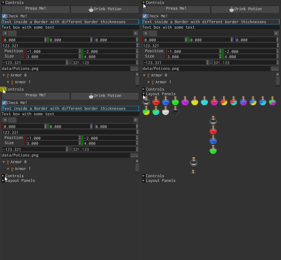
Expander

Expander is a simple collapsible container that has a header and collapsible/expandable content zone. It is used to create collapsible regions with headers.
Examples
The following example creates a simple expander with a textual header and a stack panel widget with few buttons a content:
#![allow(unused)]
fn main() {
fn create_expander(ctx: &mut BuildContext) -> Handle<Expander> {
    ExpanderBuilder::new(WidgetBuilder::new())
        // Header is visible all the time.
        .with_header(
            TextBuilder::new(WidgetBuilder::new())
                .with_text("Foobar")
                .build(ctx),
        )
        // Define a content of collapsible area.
        .with_content(
            StackPanelBuilder::new(
                WidgetBuilder::new()
                    .with_child(
                        ButtonBuilder::new(WidgetBuilder::new())
                            .with_text("Button 1")
                            .build(ctx),
                    )
                    .with_child(
                        ButtonBuilder::new(WidgetBuilder::new())
                            .with_text("Button 2")
                            .build(ctx),
                    ),
            )
            .build(ctx),
        )
        .build(ctx)
}
}
Customization
It is possible to completely change the arrow of the header of the expander. By default, the arrow consists
of crate::check_box::CheckBox widget. By changing the arrow, you can customize the look of the header.
For example, you can set the new check box with image check marks, which will use custom graphics:
#![allow(unused)]
fn main() {
fn create_expander_with_image(ctx: &mut BuildContext) -> Handle<Expander> {
    ExpanderBuilder::new(WidgetBuilder::new())
        .with_checkbox(
            CheckBoxBuilder::new(WidgetBuilder::new())
                .with_check_mark(
                    ImageBuilder::new(WidgetBuilder::new().with_height(16.0).with_height(16.0))
                        .with_opt_texture(None) // Set this to required image.
                        .build(ctx),
                )
                .with_uncheck_mark(
                    ImageBuilder::new(WidgetBuilder::new().with_height(16.0).with_height(16.0))
                        .with_opt_texture(None) // Set this to required image.
                        .build(ctx),
                )
                .build(ctx),
        )
        // The rest is omitted.
        .build(ctx)
}
}
Messages
Use ExpanderMessage::Expand message to catch the moment when its state changes:
#![allow(unused)]
fn main() {
#[derive(Visit, Clone, Reflect, Debug, Default)]
struct Game {
    expander: Handle<UiNode>,
}

impl Plugin for Game {
    fn on_ui_message(
        &mut self,
        context: &mut PluginContext,
        message: &UiMessage,
        ui_handle: Handle<UserInterface>,
    ) -> GameResult {
        if let Some(ExpanderMessage::Expand(expanded)) = message.data() {
            if message.destination() == self.expander
                && message.direction() == MessageDirection::FromWidget
            {
                println!(
                    "{} expander has changed its state to {}!",
                    message.destination(),
                    expanded
                );
            }
        }
        Ok(())
    }
}
}
To switch expander state at runtime, send ExpanderMessage::Expand to your Expander widget instance with
MessageDirection::ToWidget.