Custom Widget
It is possible to create your own widgets, that could solve a specific task that couldn’t be solved easily with the widgets that the engine provides.
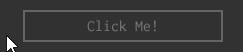
Let’s say, for instance, that we need to have a custom button with specific visual effects. It will have a border and a text, and it will also react to mouse events:
A “skeleton” of such widget could be something like this (for now it does nothing):
#![allow(unused)]
fn main() {
#[derive(Clone, Debug, Reflect, Visit, TypeUuidProvider, ComponentProvider)]
#[type_uuid(id = "e3b067e1-f3d8-4bac-a272-3c9edd960bf3")]
struct MyButtonExample {
    widget: Widget,
    border: Handle<UiNode>,
    text: Handle<UiNode>,
}

define_widget_deref!(MyButtonExample);

impl Control for MyButtonExample {
    fn handle_routed_message(&mut self, ui: &mut UserInterface, message: &mut UiMessage) {
        // Pass another message to the base widget first.
        self.widget.handle_routed_message(ui, message);
    }
}

#[derive(Debug, Clone, PartialEq)]
pub enum MyButtonMessage {
    // A message, that will be emitted when our button is clicked.
    Click,
}
impl MessageData for MyButtonMessage {}

#[derive(Clone, Debug, Reflect, Visit, TypeUuidProvider, ComponentProvider)]
#[type_uuid(id = "e3b067e1-f3d8-4bac-a272-3c9edd960bf3")]
struct MyButton {
    widget: Widget,
    border: Handle<Border>,
    text: Handle<Text>,
}

define_widget_deref!(MyButton);

impl MyButton {
    fn set_colors(&self, ui: &UserInterface, text_color: Color, border_color: Color) {
        ui.send(
            self.border,
            WidgetMessage::Foreground(Brush::Solid(border_color).into()),
        );
        ui.send(
            self.text,
            WidgetMessage::Foreground(Brush::Solid(text_color).into()),
        );

        // Make the fill brush of the border slightly dimmer than the input value.
        let mut border_color = Hsv::from(border_color);
        border_color.set_brightness(border_color.brightness() - 20.0);
        ui.send(
            self.border,
            WidgetMessage::Background(Brush::Solid(border_color.into()).into()),
        );
    }
}

impl Control for MyButton {
    fn handle_routed_message(&mut self, ui: &mut UserInterface, message: &mut UiMessage) {
        // Pass another message to the base widget first.
        self.widget.handle_routed_message(ui, message);

        // Then process it in our widget.
        if let Some(msg) = message.data::<WidgetMessage>() {
            if message.destination() == self.handle()
                || self.has_descendant(message.destination(), ui)
            {
                match msg {
                    WidgetMessage::MouseUp { .. } => {
                        // Send the message to outside world, saying that the button was clicked.
                        ui.post(self.handle(), MyButtonMessage::Click);
                        ui.release_mouse_capture();
                    }
                    WidgetMessage::MouseDown { .. } => {
                        ui.capture_mouse(message.destination());
                    }
                    WidgetMessage::MouseEnter => {
                        // Make both the border and text brighter when the mouse enter the bounds of our button.
                        self.set_colors(
                            ui,
                            Color::opaque(220, 220, 220),
                            Color::opaque(140, 140, 140),
                        );
                    }
                    WidgetMessage::MouseLeave => {
                        // Make both the border and text dimmer when the mouse leaves the bounds of our button.
                        self.set_colors(
                            ui,
                            Color::opaque(120, 120, 120),
                            Color::opaque(100, 100, 100),
                        );
                    }
                    _ => (),
                }
            }
        }
    }
}

pub struct MyButtonBuilder {
    widget_builder: WidgetBuilder,
    // Some text of our button.
    text: String,
}

impl MyButtonBuilder {
    pub fn new(widget_builder: WidgetBuilder) -> Self {
        Self {
            widget_builder,
            text: Default::default(),
        }
    }

    pub fn with_text(mut self, text: String) -> Self {
        self.text = text;
        self
    }

    pub fn build(self, ctx: &mut BuildContext) -> Handle<UiNode> {
        let text = TextBuilder::new(
            WidgetBuilder::new()
                .with_vertical_alignment(VerticalAlignment::Center)
                .with_horizontal_alignment(HorizontalAlignment::Center),
        )
        .with_text(self.text)
        .build(ctx);

        let border = BorderBuilder::new(WidgetBuilder::new().with_child(text))
            .with_stroke_thickness(Thickness::uniform(2.0).into())
            .build(ctx);

        let button = MyButton {
            widget: self.widget_builder.with_child(border).build(ctx),
            border,
            text,
        };

        ctx.add_node(UiNode::new(button))
    }
}

fn my_button_builder_usage(ctx: &mut BuildContext) {
    MyButtonBuilder::new(WidgetBuilder::new().with_width(200.0).with_height(32.0))
        .with_text("Click Me!".to_string())
        .build(ctx);
}

#[derive(Default, Visit, Clone, Reflect, Debug)]
struct MyPlugin {
    my_button: Handle<UiNode>,
}

impl Plugin for MyPlugin {
    fn on_ui_message(
        &mut self,
        context: &mut PluginContext,
        message: &UiMessage,
        ui_handle: Handle<UserInterface>,
    ) -> GameResult {
        if message.destination() == self.my_button {
            if let Some(MyButtonMessage::Click) = message.data() {
                // Do something.
            }
        }
        Ok(())
    }
}
}
Every widget in the engine must have an instance of Widget (widget: Widget field) type in them and implement the
Control trait with two required methods. query_component is used for dynamic component fetching and could be used
to support behavior mix-ins and support derived widgets, that based on some other widgets. There’s a lot more of
available methods in the Control trait, however for simplicity we won’t use it in this chapter.
handle_routed_message is used to react to various messages, but only in the child -> parent -> parent_of_parent -> ...
chain. For example, if some of the child widget of our button will receive a message, it will also be passed to our button,
then to a parent of our button (if any), etc. This routing strategy is called “bubble” routing (it acts like a bubble of
air in the water; it always goes up). See this section for
more info.
Custom Logic
Now let’s add some logic to the button, that will handle various mouse events. The full version of our button widget’s logic will be like so:
#![allow(unused)]
fn main() {
#[derive(Debug, Clone, PartialEq)]
pub enum MyButtonMessage {
    // A message, that will be emitted when our button is clicked.
    Click,
}
impl MessageData for MyButtonMessage {}

#[derive(Clone, Debug, Reflect, Visit, TypeUuidProvider, ComponentProvider)]
#[type_uuid(id = "e3b067e1-f3d8-4bac-a272-3c9edd960bf3")]
struct MyButton {
    widget: Widget,
    border: Handle<Border>,
    text: Handle<Text>,
}

define_widget_deref!(MyButton);

impl MyButton {
    fn set_colors(&self, ui: &UserInterface, text_color: Color, border_color: Color) {
        ui.send(
            self.border,
            WidgetMessage::Foreground(Brush::Solid(border_color).into()),
        );
        ui.send(
            self.text,
            WidgetMessage::Foreground(Brush::Solid(text_color).into()),
        );

        // Make the fill brush of the border slightly dimmer than the input value.
        let mut border_color = Hsv::from(border_color);
        border_color.set_brightness(border_color.brightness() - 20.0);
        ui.send(
            self.border,
            WidgetMessage::Background(Brush::Solid(border_color.into()).into()),
        );
    }
}

impl Control for MyButton {
    fn handle_routed_message(&mut self, ui: &mut UserInterface, message: &mut UiMessage) {
        // Pass another message to the base widget first.
        self.widget.handle_routed_message(ui, message);

        // Then process it in our widget.
        if let Some(msg) = message.data::<WidgetMessage>() {
            if message.destination() == self.handle()
                || self.has_descendant(message.destination(), ui)
            {
                match msg {
                    WidgetMessage::MouseUp { .. } => {
                        // Send the message to outside world, saying that the button was clicked.
                        ui.post(self.handle(), MyButtonMessage::Click);
                        ui.release_mouse_capture();
                    }
                    WidgetMessage::MouseDown { .. } => {
                        ui.capture_mouse(message.destination());
                    }
                    WidgetMessage::MouseEnter => {
                        // Make both the border and text brighter when the mouse enter the bounds of our button.
                        self.set_colors(
                            ui,
                            Color::opaque(220, 220, 220),
                            Color::opaque(140, 140, 140),
                        );
                    }
                    WidgetMessage::MouseLeave => {
                        // Make both the border and text dimmer when the mouse leaves the bounds of our button.
                        self.set_colors(
                            ui,
                            Color::opaque(120, 120, 120),
                            Color::opaque(100, 100, 100),
                        );
                    }
                    _ => (),
                }
            }
        }
    }
}
}
As you can see, the most of the code was placed in handle_routed_message, we using it to respond for four messages:
MouseDown + MouseUp, MouseEnter + MouseLeave. Let’s look closely at each pair of the messages.
The first two messages is used to handle clicks and send appropriate message to the outside world if a click has happened. When you’re sending a message, it is not immediately processed, instead it is put in the common message queue and will be processed by the engine later. You can react to such messages to perform a desired action, see the section below for more info.
The last two events are used to alter the visual appearance of the button by changing the colors of both the border and the text. The source code above is very simple and straightforward, despite the look of it.
Builder
Did you notice, that we didn’t assign anything to border and text handles in our button widget? It is because, we
haven’t made a respective builder for our button. Builder is a separate structure, that collects all the info from
the outside world and “compiles” it into a finished widget. Usually, widgets contains a bunch of children widgets, which
in their turn could have their own children and so on. In our case, the button will have two child widgets: a border and
a text.
#![allow(unused)]
fn main() {
pub struct MyButtonBuilder {
    widget_builder: WidgetBuilder,
    // Some text of our button.
    text: String,
}

impl MyButtonBuilder {
    pub fn new(widget_builder: WidgetBuilder) -> Self {
        Self {
            widget_builder,
            text: Default::default(),
        }
    }

    pub fn with_text(mut self, text: String) -> Self {
        self.text = text;
        self
    }

    pub fn build(self, ctx: &mut BuildContext) -> Handle<UiNode> {
        let text = TextBuilder::new(
            WidgetBuilder::new()
                .with_vertical_alignment(VerticalAlignment::Center)
                .with_horizontal_alignment(HorizontalAlignment::Center),
        )
        .with_text(self.text)
        .build(ctx);

        let border = BorderBuilder::new(WidgetBuilder::new().with_child(text))
            .with_stroke_thickness(Thickness::uniform(2.0).into())
            .build(ctx);

        let button = MyButton {
            widget: self.widget_builder.with_child(border).build(ctx),
            border,
            text,
        };

        ctx.add_node(UiNode::new(button))
    }
}
}
This is how a button is created, at first we’re creating a border widget instance with a text widget as a child of it.
Text widget uses the actual text string from our builder, and also it sets the desired alignment in parent border’s
bounds. Finally, we’re initializing an instance of MyButton with the handles of the widget we’ve just made and as
the last step we’re adding the widget to the user interface.
Using the Builder
The widget could be created using the builder we’ve just made like so:
#![allow(unused)]
fn main() {
fn my_button_builder_usage(ctx: &mut BuildContext) {
    MyButtonBuilder::new(WidgetBuilder::new().with_width(200.0).with_height(32.0))
        .with_text("Click Me!".to_string())
        .build(ctx);
}
}
Reacting to Click Messages
Our button sends a Click message every time when it was pressed, and we can use this message to perform some actions
in an application. All you need to do is to catch MyButtonMessage::Click in Plugin::on_ui_message and do something
in response:
#![allow(unused)]
fn main() {
#[derive(Default, Visit, Clone, Reflect, Debug)]
struct MyPlugin {
    my_button: Handle<UiNode>,
}

impl Plugin for MyPlugin {
    fn on_ui_message(
        &mut self,
        context: &mut PluginContext,
        message: &UiMessage,
        ui_handle: Handle<UserInterface>,
    ) -> GameResult {
        if message.destination() == self.my_button {
            if let Some(MyButtonMessage::Click) = message.data() {
                // Do something.
            }
        }
        Ok(())
    }
}
}
Custom widget or composition of widgets.
When do you need a custom widget? The answer depends on the use case, but the general rules here is quite simple:
- If your widget exist in a single instance, then there is no need to create a custom widget for it.
- If you need to create multiple instances of your widget, and each widget will carry some specific data, then you definitely need a custom widget.
Custom widgets have some limitations that could be limiting, one of them is that custom widgets do not have access to your code, since they’re “living” inside UI and know nothing about the “environment” where they’re being used.
Source Code and Web Demo
Full source code for this chapter can be found here , and you can also run web demo to see it in action.