Check box
Checkbox is a UI widget that have three states - Checked, Unchecked and Undefined. In most cases it is used
only with two values which fits in bool type. Third, undefined, state is used for specific situations when your
data have such state.
How it looks
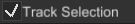
Checkbox in Checked state:
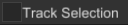
Checkbox in Unchecked state:
How to create
To create a checkbox you should do something like this:
#![allow(unused)]
fn main() {
extern crate fyrox;
use fyrox::{
    core::pool::Handle,
    gui::{check_box::CheckBoxBuilder, widget::WidgetBuilder, UiNode, UserInterface},
};
fn create_checkbox(ui: &mut UserInterface) -> Handle<UiNode> {
    CheckBoxBuilder::new(WidgetBuilder::new())
        // A custom value can be set during initialization.
        .checked(Some(true))
        .build(&mut ui.build_ctx())
}
}
The above code will create a checkbox without any textual info, but usually checkboxes have some useful info
near them. To create such checkbox, you could use .with_content(..) method which accepts any widget handle.
For checkbox with text, you could use TextBuilder to create textual content, for checkbox with text - use
ImageBuilder. As already said, you're free to use any widget handle there.
Here's an example of checkbox with textual content.
#![allow(unused)]
fn main() {
extern crate fyrox;
use fyrox::{
    core::pool::Handle,
    gui::{
        check_box::CheckBoxBuilder, text::TextBuilder, widget::WidgetBuilder, UiNode,
        UserInterface,
    },
};
fn create_checkbox(ui: &mut UserInterface) -> Handle<UiNode> {
    let ctx = &mut ui.build_ctx();

    CheckBoxBuilder::new(WidgetBuilder::new())
        // A custom value can be set during initialization.
        .checked(Some(true))
        .with_content(
            TextBuilder::new(WidgetBuilder::new())
                .with_text("This is a checkbox")
                .build(ctx),
        )
        .build(ctx)
}
}
Message handling
Checkboxes are not static widget and have multiple states. To handle a message from a checkbox, you need to handle
a CheckBoxMessage::Check message. To do so, you can do something like this:
#![allow(unused)]
fn main() {
extern crate fyrox;
use fyrox::{
    core::pool::Handle,
    engine::Engine,
    event_loop::ControlFlow,
    gui::{check_box::CheckBoxMessage, message::UiMessage, UiNode},
    plugin::PluginContext,
};

struct Foo {
    checkbox: Handle<UiNode>,
}

impl Foo {
fn on_ui_message(
    &mut self,
    context: &mut PluginContext,
    message: &UiMessage,
    control_flow: &mut ControlFlow,
) {
    if let Some(CheckBoxMessage::Check(value)) = message.data() {
        if message.destination() == self.checkbox {
            //
            // Insert your clicking handling code here.
            //
        }
    }
}
}
}
Keep in mind that checkbox (as any other widget) generates WidgetMessage instances. You can catch them too and
do a custom handling if you need.
Theme
Checkbox can be fully customized to have any look you want, there are few methods that will help you with customization:
.with_content(..)- sets the content that will be shown near the checkbox..with_check_mark(..)- sets the widget that will be used as checked icon..with_uncheck_mark(..)- sets the widget that will be used as unchecked icon..with_undefined_mark(..)- sets the widget that will be used as undefined icon.